darkhyuuga
Full Member
 D.gray man... enough said.
Posts: 156
|
Post by darkhyuuga on Sept 30, 2007 9:26:37 GMT -5
lol it took a loooong while (espeacilly to find all the brushes and stuff) but i finally got them all done.... (well most of em done.) i printed this one out and use it as a bookmark for storm thief (i'm reading it agian lol) ;D  |
|
darkhyuuga
Full Member
D.gray man... enough said.
Posts: 156
|
Post by darkhyuuga on Sept 30, 2007 9:27:41 GMT -5
i might have to resize it and add more lil stuff here and there but dats ^^ da main concept
|
|
darkhyuuga
Full Member
D.gray man... enough said.
Posts: 156
|
Post by darkhyuuga on Sept 30, 2007 13:04:33 GMT -5
|
|
darkhyuuga
Full Member
D.gray man... enough said.
Posts: 156
|
Post by darkhyuuga on Sept 30, 2007 13:05:53 GMT -5
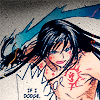
and last Poison... i plan 2 do one more for the fade, the day it comes out
|
|
darkhyuuga
Full Member
D.gray man... enough said.
Posts: 156
|
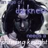
Post by darkhyuuga on Sept 30, 2007 13:07:02 GMT -5
dis wus the hardest to do.. so i'm not sure how da rest of uall will feel about it, but i like it...  |
|
Thunderous
Full Member
They Have Pulled Down Deep Heaven on Their Heads
Posts: 210
|
Post by Thunderous on Sept 30, 2007 21:59:43 GMT -5
Wow, these are all really great! Much better than anything I could come up with, that's for sure  The Storm thief one is probably my favorite, but I like the Poison one as well. The Haunting one seems almost a little bland in comparison though, maybe put some fanart in it? |
|
|
|
Post by GhostEggplant on Sept 30, 2007 22:41:06 GMT -5
The font in The Haunting make it look like it says 'The Haunting of Alaizabel Crap".
I really love all of them! Lovely use of color. ;D
|
|
|
|
Post by shyviolet on Oct 1, 2007 2:21:42 GMT -5
I like them, but I'd agree that the Alaizabel one lags behind the others.
Why does the Poison one say 'Cheri' on it?
|
|
|
|
Post by lisajane on Oct 1, 2007 6:00:03 GMT -5
I like the Poison one best by far.
I think though the font for 'Havoc' looks really out of place on the Haunting one. It looks like you've just spraypainted it on in Paint.
|
|
darkhyuuga
Full Member
D.gray man... enough said.
Posts: 156
|
Post by darkhyuuga on Oct 1, 2007 17:11:26 GMT -5
lol... the haunting was the hardest to do, but i'll definatly work on that one. Poison says cheri because the S got cut off. it was supposed to say CHERISH next to the girl. And as for the color scheme.... its all from the book cover... I used Storm Thiefs green and yellow scheme. and Poison's Purple (but i made it a purple steel kinda thing....) i would like to make The Haunting as good as the rest, i just need a concept to work on.... (i have an nother version... with a red telephone booth ) but that still needs work.... any more critisism willl be apprciated.
|
|
darkhyuuga
Full Member
D.gray man... enough said.
Posts: 156
|
Post by darkhyuuga on Oct 1, 2007 17:13:58 GMT -5
oh and the Haunting of Alaizable Crap needs a "Chris Wooding's" and maybe a subtitle under it... like the rest...
|
|
|
|
Post by bluephoenix on Oct 1, 2007 21:01:55 GMT -5
THESE ARE AMAZING!! Especially Storm Thief!! VERY AWESOME!!
|
|
|
|
Post by zemira on Oct 4, 2007 9:40:33 GMT -5
Gotta agree that I like the Poison one, but the "Cheri" is odd. ^_^
I did like the Haunting one, but yeah, the "havoc" really stood out, even more than the title. >_<
|
|
|
|
Post by kaiku on Oct 4, 2007 13:00:32 GMT -5
I love them all, but that Poison one is simply fabulous!
|
|
marleen
Full Member
Wazowski!
Posts: 122
|
Post by marleen on Oct 5, 2007 3:03:35 GMT -5
The Stom Thief one is just perfect! In the Alaizabel one I'd remove the "havoc", it looks kind of cheap, and the cray does indeed read like "crap"  In Poison, I have no problem with the CHERI, but I don't think you spell it "fairy tail" - was that on purpose? If so I don't it. They look cool, really catch the eye, but like I said, I like the Storm Thief one best  |
|


 The Storm thief one is probably my favorite, but I like the Poison one as well. The Haunting one seems almost a little bland in comparison though, maybe put some fanart in it?